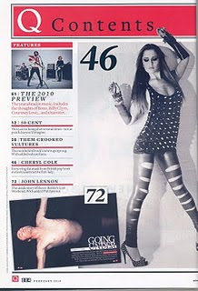
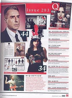
 Her legs are facing inwards, her back is pulled in which forms more shape to her and her hands are in the air. This awkward pose could symbolise the strange things happening in her life and how her life is changing. On the second contents page there are 7 mini images of artists that are featured in the magazine.
The front page uses red, black and white. this is consistent through out the whole magazine, so the same house style is developed, the font is sans serif and they used a formal font which is similar to Times. This gives the magazine a more serious tone. The subheadings are big, black and bold. This method of text is effective, because it grabs the readers attention. It's also useful as the reader knows directly where to go without having to read the smaller print beneath the heading. The subheadings are positioned beneath each other and they're separated by a thick red line.
The way the contents page is constructed indicates that the magazine is well-organised, high standard and detailed. Which gives the reader the impression that the rest of the magazine will be at the same standard and this could make the reader want to continue reading. The magazine contains a couple of promotional features about, Bono, Biffy Clyro and Courtney Love. This could enhance sales for all theses artists, but also for Q magazine for example they'd be known for promoting these artists.
 The 'Q' is present on both contents pages; however on the first contents page it says 'Q contents' in serif font this is placed in a bright red border with the Q in white and contents in black.
This is another good, detailed analysis. Do you think that Q magazine would have featured Cheryl Cole when she was in Girls Aloud? If not, why not?
ReplyDelete