Monday, 15 November 2010

Article in Progress

Hello Eskay, what can I say! That was a jaw-dropping performance, how do you feel right now?
I can still feel the adrenaline I get when I ’m about to go up on stage, the feeling is incredible; I want it to last forever!
Is this your first time performing at Stratford Circus?
No it’s not actually. I’ve performed here quite a few times in the past couple of years. My first time was when I was 14 I performed one of my first songs, it was called ‘Mystery’. It was about not knowing what was going to happen to me ext or if tomorrow is going to come so that’s what inspired my song. I then did a two year project with Urban Development. I was in a girl group called KEN; we performed songs called ‘Wont Stop’ and ‘Right Here’; both songs written by the group. I think this experience really helped me develop as an artist and it was also at Urban Development that I got scouted by Producer Darren Martyn who produced hit singles like ‘Crush’ sung by famous U.K artist ‘Fugative’ who is now writing music for artists in America, so that really inspires me to work hard and to be grateful to those who helped me reach where I am today.
In what ways did this gig differ to your last in Edinburgh?
Mmm, Edinburgh was much more exciting because it was fresh and new and I knew I had to be outstanding since it was my first time there. I mean I love to make a good impression, especially when its a new fan base I’m trying to reach out to
Everyone thinks you’re wonderful, but we somehow get the impression your days are long. Want to talk us through it?
LOL okay, I’ll be glad to...
I wake up at 5 for my daily 20minute jog. It’s important to keep fit. I then return to my house at about 05:30am to have my nutritious packed breakfast. Breakfast hasn’t always been important to me, but as I got older & started the music business I realised the impact it would have on me if I did forget to have breakfast at around 7 I made my way to my dance rehearsal, only to find that my dancers went to another hall so I had to wait an extra 30mins for their arrival. Instead of sitting around ad waiting I decided to practice on my own like my mum used to say "PRACTICE MAKES PERFECT". Finally, at 8 my dancers arrived, and we had to get started as soon as possible. Rehearsals finished at 10:30am, was I knackered or what! I went back home and got a couple of hours to sleep, my vocal trainer then came to my house to get me warmed up for the show.

Magazine Analysis: Top Of The Pops Magazine

The artist featured in the article is Justin Bieber. The read directly knows that the target audience is to teenage girls. The language used is quite friendly and personal, this style of writing is appealing to the reader because it makes us feel closer to the singer and that were actually talking to him which is the whole point of an interview, for example a personal question would be “how important is your mum?” this type of question is very personal, however it could also be an intimidating question because Bieber has to answer whether he wants to or not. The interviewer also sets a friendly tone by complimenting him on his talent for instance they ask “How did you nurture your brilliant talent?” This question seems friendly and caring, because they’re not just asking him about his talent, but they’re telling him how ‘brilliant’ it is and it sounds like a kind of question someone you really knew would ask you this question. A basic hot pink Arial Black font is used on a white background for the questions, the effect of this is to make it stand out and the font used for the answers is sans serith and black. This effect makes the questions stand out a lot more, however the colours used indicate that it’s targeting a more female audience. We know this, because pink black a white is a combination of colours that people stereotype as feminine colours. The interview is a two-page spread, and the same main image that was on the cover of the magazine partially covers both pages. There are three other images of Bieber; one when he was a baby, a picture of him and his mum and another with him and usher. The three images link back to the interview questions. Bieber is made to look like a “momma’s boy”, which could be appealing to the target audience and he’s being promoted as a teenage sensation who’s grateful for what he’s got now and how the life he’s living seems like a miracle to him as he went from “rags to riches”. In this article there are quoted puffs like “We lived in a small, shabby apartment”. The font of this text is pink, big & bold to emphasise that he started off like any other citizen in America but managed to make it big in the music industry, it’s also inspiring for the readers as they get a feel of what his life used to be like and it inspires them to have ambitions no matter what. The fonts and colours used on the magazine cover is quite similar to the pages in the magazine for instance, there’s a lot of bright, pink and purple colours on the cover and in the articles are the same colours. The heading “MOST WANTED!” is bold, big and white on a candy floss pink banner with the American flag in pink and white. The audience directly knows that he’s a famous American celebrity.

Monday, 8 November 2010

Q Magazine Contents Page Analysis

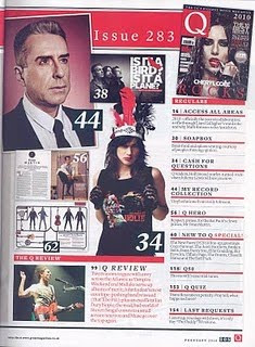
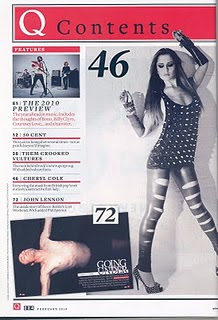
Q magazine has two contents pages. on the first content page there are three fairly large images. One of John Lennon and anchorage text beside it, half of the contents page is taken by a long shot of Cheryl Cole. Cole is positioned in an awkward pose. Her legs are facing inwards, her back is pulled in which forms more shape to her and her hands are in the air. This awkward pose could symbolise the strange things happening in her life and how her life is changing. On the second contents page there are 7 mini images of artists that are featured in the magazine.
The front page uses red, black and white. this is consistent through out the whole magazine, so the same house style is developed, the font is sans serif and they used a formal font which is similar to Times. This gives the magazine a more serious tone. The subheadings are big, black and bold. This method of text is effective, because it grabs the readers attention. It's also useful as the reader knows directly where to go without having to read the smaller print beneath the heading. The subheadings are positioned beneath each other and they're separated by a thick red line.
The way the contents page is constructed indicates that the magazine is well-organised, high standard and detailed. Which gives the reader the impression that the rest of the magazine will be at the same standard and this could make the reader want to continue reading. The magazine contains a couple of promotional features about, Bono, Biffy Clyro and Courtney Love. This could enhance sales for all theses artists, but also for Q magazine for example they'd be known  for promoting these artists.
The 'Q' is present on both contents pages; however on the first contents page it says 'Q contents' in serif font this is placed in a bright red border with the Q in white and contents in black.

Magazine Article Analysis

[k+feature+4.bmp]The artist featured in the article suggests that the target audience will be Cheryl Cole's fans, young boys and girls, aspiring singers and the Newcastle community she's from.
The language used suggests its for higher educated people, because the vocabulary is fairly complex. The article uses semiotic codes to communicate about Cheryl Cole and how she's developing as an artist; publicly, physically and emotionally.

When I see the images I get the impression that Cole seems considerably unattainable, for instance her spiked vest top emits an aggressive style and it looks as though its her armor.
Although the magazine seems sophisticated, the writer still quotes Cheryl's profane language.
On all of the pages, the same sans serif font is used. The text looks like a Times Roman font which is quite formal. The text is arranged in columns, its neat and organised. Cheryl’s photo only takes up ¼ of the page and the rest is text; however there are a couple of spreads photos of Cole. This could indicate that the article is more important than her image and for the reader to not lose concentration, because if there's too much text the reader could get bored quite quickly.

The tone of the article is quite friendly, but also direct. They’re trying to convey that Cheryl Cole is this rising ‘Phenomenon’ from the U.K. Cole is presented as a new woman; revealing clothes, red lipstick, dark eye makeup. The setting of the images portrays a rebellious side to Cole. The tight black cat suit accentuates her figure, giving her an ideal female body shape. Her red lipstick symbolises fierceness. The black motorcycle gives the impression she’s adventurous and untamed.

[K+feature+2.bmp]An effective house style is used. Basic colours such as red, white and black are used throughout the whole article. The colours are effective because they’re bold and they bounce off each other. The front page has a big red ‘X’ on a black background. This ‘X’ could symbolise Cheryl’s new persona the article is trying to exploit; she’s more fierce, sexier and untouchable. The ‘X’ represents a sort of barrier or fence that withdraws us from her other side. This isn’t the first time the public has witnessed an artist developing a new persona, in the music industry they call it an ‘Alter Ego’, although Cheryl doesn’t mention anything about her other side, she does say ‘I’m a completely different person’ and the article says ‘Cheryl is happy to become someone not quite herself’. This gives the audience the impression that Cheryl’s becoming a new artist; developing new features such as green eyes (contacts) and ‘new’ feline eyebrows.

The article doesn’t necessarily demand prior knowledge; however it does talk about Cheryl’s previous experience in the music industry. For instance they talk about her former girl band 'Girls Aloud' where she started her name and her footballer ex husband Ashley Cole. The article mentions every aspect of her life, this implies that they're interested in her and so is the reader.