
Wednesday, 15 December 2010
Magazine Mock Up
Sunday, 12 December 2010
Title Blocks
 The word vibe is written in red, block capitals. Red is a commonly used colour with music magazines. It stands out, vibrant and bright. It can also symbolise the type of magazine it's about, maybe the red represents the passion it has for music as many people relate red as being a passionate colour. Behind this text, is what looks like the top of an old 60's hat. It's not easy to work out what it is which adds a mistic feel to the magazine making it more interesting to readers.
The font is a basic thick sans serif font, however the first 3 letters are in capitals, but the 'e' is in and the 'v' is slightly slanted. Although it's very subtle creativity its does take away the seriousness of the magazine and makes it more appealing to readers.
 This title block seems quite dull despite the fact yellow is a bright colour but looks dull against black. 'SOURCE' is deliberately written in big bold yellow caps horizontally to show its importance over 'the'. This method is effective as the reader instatntly gets the impression that this magazine is the source of all information needed. The font is sans serif and looks about a size 16. I think the magazine title is quite unique as most magazines end up using typical colours, but this seems a bit out the box which could symbolise originality and some readers may be able to relate to that as individuals.
  Q magazine is quite famos. The 'Q' is an acronym of the word 'Cue'. The font of the letter looks like a serif font, its big, white and similar to Time New Roman. Tis title block is very effective as it contains solely the letter 'Q'. This letter is made centre of attention, it's quick, short and snappy which makes it easier for readers to remember. The choice of red and white is common but this title brings something else to the table for readers. The font could represent the type of reader they're trying to attract as it seems quite sophisticated and we get the impression that it's and older company because of it. The red could symbolise its passion for music and could be appealing for people who love music.
Like 'Q' and 'Vibe', NME uses the three typical colours; red, black and white. These three colours are popular in the magazine industry which could take away the originality of magazines and make it more diffcult for readers to instantly recognise which one is which.
Ideal Reader Profile
My reader is called Leanne, she's 17 and is currently completing her A2 courses in a local Sixth Form. During the week-end she juggles school work and a part time job in retail. She lives in Hackney, East London where UK music is very well acknowledged & praised. Her mum is a primary school teacher and her Dad is a bus driver. She's currently living in the same household as them alongside two younger siblings. This would put her in the C2 socio economic scale. My magazine is suitable for Leanne as she's been edcuated; more than 5 A-C grades at GCSE & two 'A's' and a 'B' at A2. The ability to comprehend english to a certain extent is essential in order to be interested in my magazine as it will have quite formal language and detailed text. Leanne also enjoys going to parties with her friends and taking part in community activities such as dancing and singing. Besides her hobbies Leanne has bigger ambitions, she plans on going to univeristy and studying Veterinary Medicine & French as an extra. On the front cover of my magazine will be people in her age group dressed in her style with similar hair. This will be appealing to Leanne as she will be able to identify with them.
Monday, 6 December 2010
Proposal For My Magazine
The genre I have chosen for my magazine is UK music. The age group I'm targeting will be between 16-24 which is C1 to D on the socio economic scale, it'll be appealing for both males and females of that age of any ethnicity. Majority of the magazine will be about upcoming artists in the U.K, whether they're 'House' arists or 'Dancehall' artists. I will be targeting urban areas which are interested in Hip-hop and R&B music produced in the U.K so preferably inner cities, for example East and South London. I reckon this type of magazine is needed in the magazine industry, because there aren't many valued music magazines entirely based on upcoming and established UK artists. I've also realised that if this gap in the market is filled it can have a positive effect for underground UK artists who think that the only way to success is by going to America. However this magazine can be their road to discoveryor promotion, in addition I think it could boost the British reputation in music as we dont get much recognition, but once this magazine comes into place UK artists can mention that they did a feature in our magazine. I reckon because it's such a big gap if its finally established it could be easily recognised as it would be one of the few UK based magazines.
Monday, 15 November 2010
Article in Progress
Hello Eskay, what can I say! That was a jaw-dropping performance, how do you feel right now?
I can still feel the adrenaline I get when I ’m about to go up on stage, the feeling is incredible; I want it to last forever!
Is this your first time performing at Stratford Circus?
No it’s not actually. I’ve performed here quite a few times in the past couple of years. My first time was when I was 14 I performed one of my first songs, it was called ‘Mystery’. It was about not knowing what was going to happen to me ext or if tomorrow is going to come so that’s what inspired my song. I then did a two year project with Urban Development. I was in a girl group called KEN; we performed songs called ‘Wont Stop’ and ‘Right Here’; both songs written by the group. I think this experience really helped me develop as an artist and it was also at Urban Development that I got scouted by Producer Darren Martyn who produced hit singles like ‘Crush’ sung by famous U.K artist ‘Fugative’ who is now writing music for artists in America, so that really inspires me to work hard and to be grateful to those who helped me reach where I am today.
In what ways did this gig differ to your last in Edinburgh?
Mmm, Edinburgh was much more exciting because it was fresh and new and I knew I had to be outstanding since it was my first time there. I mean I love to make a good impression, especially when its a new fan base I’m trying to reach out to
Everyone thinks you’re wonderful, but we somehow get the impression your days are long. Want to talk us through it?
LOL okay, I’ll be glad to...
I wake up at 5 for my daily 20minute jog. It’s important to keep fit. I then return to my house at about 05:30am to have my nutritious packed breakfast. Breakfast hasn’t always been important to me, but as I got older & started the music business I realised the impact it would have on me if I did forget to have breakfast at around 7 I made my way to my dance rehearsal, only to find that my dancers went to another hall so I had to wait an extra 30mins for their arrival. Instead of sitting around ad waiting I decided to practice on my own like my mum used to say "PRACTICE MAKES PERFECT". Finally, at 8 my dancers arrived, and we had to get started as soon as possible. Rehearsals finished at 10:30am, was I knackered or what! I went back home and got a couple of hours to sleep, my vocal trainer then came to my house to get me warmed up for the show.
Magazine Analysis: Top Of The Pops Magazine

The artist featured in the article is Justin Bieber. The read directly knows that the target audience is to teenage girls. The language used is quite friendly and personal, this style of writing is appealing to the reader because it makes us feel closer to the singer and that were actually talking to him which is the whole point of an interview, for example a personal question would be “how important is your mum?” this type of question is very personal, however it could also be an intimidating question because Bieber has to answer whether he wants to or not. The interviewer also sets a friendly tone by complimenting him on his talent for instance they ask “How did you nurture your brilliant talent?” This question seems friendly and caring, because they’re not just asking him about his talent, but they’re telling him how ‘brilliant’ it is and it sounds like a kind of question someone you really knew would ask you this question. A basic hot pink Arial Black font is used on a white background for the questions, the effect of this is to make it stand out and the font used for the answers is sans serith and black. This effect makes the questions stand out a lot more, however the colours used indicate that it’s targeting a more female audience. We know this, because pink black a white is a combination of colours that people stereotype as feminine colours. The interview is a two-page spread, and the same main image that was on the cover of the magazine partially covers both pages. There are three other images of Bieber; one when he was a baby, a picture of him and his mum and another with him and usher. The three images link back to the interview questions. Bieber is made to look like a “momma’s boy”, which could be appealing to the target audience and he’s being promoted as a teenage sensation who’s grateful for what he’s got now and how the life he’s living seems like a miracle to him as he went from “rags to riches”. In this article there are quoted puffs like “We lived in a small, shabby apartment”. The font of this text is pink, big & bold to emphasise that he started off like any other citizen in America but managed to make it big in the music industry, it’s also inspiring for the readers as they get a feel of what his life used to be like and it inspires them to have ambitions no matter what. The fonts and colours used on the magazine cover is quite similar to the pages in the magazine for instance, there’s a lot of bright, pink and purple colours on the cover and in the articles are the same colours. The heading “MOST WANTED!” is bold, big and white on a candy floss pink banner with the American flag in pink and white. The audience directly knows that he’s a famous American celebrity.
Monday, 8 November 2010
Q Magazine Contents Page Analysis
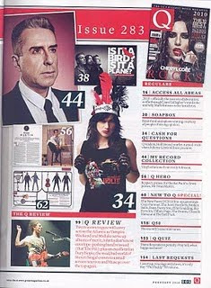
Q magazine has two contents pages. on the first content page there are three fairly large images. One of John Lennon and anchorage text beside it, half of the contents page is taken by a long shot of Cheryl Cole. Cole is positioned in an awkward pose.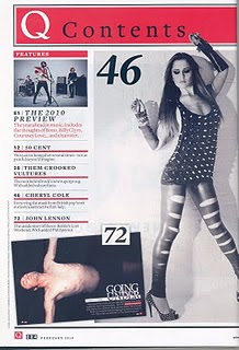 Her legs are facing inwards, her back is pulled in which forms more shape to her and her hands are in the air. This awkward pose could symbolise the strange things happening in her life and how her life is changing. On the second contents page there are 7 mini images of artists that are featured in the magazine.
The front page uses red, black and white. this is consistent through out the whole magazine, so the same house style is developed, the font is sans serif and they used a formal font which is similar to Times. This gives the magazine a more serious tone. The subheadings are big, black and bold. This method of text is effective, because it grabs the readers attention. It's also useful as the reader knows directly where to go without having to read the smaller print beneath the heading. The subheadings are positioned beneath each other and they're separated by a thick red line.
The way the contents page is constructed indicates that the magazine is well-organised, high standard and detailed. Which gives the reader the impression that the rest of the magazine will be at the same standard and this could make the reader want to continue reading. The magazine contains a couple of promotional features about, Bono, Biffy Clyro and Courtney Love. This could enhance sales for all theses artists, but also for Q magazine for example they'd be known for promoting these artists.
 The 'Q' is present on both contents pages; however on the first contents page it says 'Q contents' in serif font this is placed in a bright red border with the Q in white and contents in black.
 Her legs are facing inwards, her back is pulled in which forms more shape to her and her hands are in the air. This awkward pose could symbolise the strange things happening in her life and how her life is changing. On the second contents page there are 7 mini images of artists that are featured in the magazine.
The front page uses red, black and white. this is consistent through out the whole magazine, so the same house style is developed, the font is sans serif and they used a formal font which is similar to Times. This gives the magazine a more serious tone. The subheadings are big, black and bold. This method of text is effective, because it grabs the readers attention. It's also useful as the reader knows directly where to go without having to read the smaller print beneath the heading. The subheadings are positioned beneath each other and they're separated by a thick red line.
The way the contents page is constructed indicates that the magazine is well-organised, high standard and detailed. Which gives the reader the impression that the rest of the magazine will be at the same standard and this could make the reader want to continue reading. The magazine contains a couple of promotional features about, Bono, Biffy Clyro and Courtney Love. This could enhance sales for all theses artists, but also for Q magazine for example they'd be known for promoting these artists.
 The 'Q' is present on both contents pages; however on the first contents page it says 'Q contents' in serif font this is placed in a bright red border with the Q in white and contents in black.
Magazine Article Analysis
![[k+feature+4.bmp]](https://blogger.googleusercontent.com/img/b/R29vZ2xl/AVvXsEiKb_0XIpWVZBE8ELuhyphenhyphensjxVsRp5k5wSh0VF3bU1pihHcDCPR5lWLSu6dPdWfHocgnalFVerdcQnYDs9KCpFcn5hE-8Yrj4azVkb6moNFnU1dgiqxuEeI8clCvstBfugao1FyXUZSrry6WB/s1600/k+feature+4.bmp) The artist featured in the article suggests that the target audience will be Cheryl Cole's fans, young boys and girls, aspiring singers and the Newcastle community she's from.
The artist featured in the article suggests that the target audience will be Cheryl Cole's fans, young boys and girls, aspiring singers and the Newcastle community she's from.The language used suggests its for higher educated people, because the vocabulary is fairly complex. The article uses semiotic codes to communicate about Cheryl Cole and how she's developing as an artist; publicly, physically and emotionally.
When I see the images I get the impression that Cole seems considerably unattainable, for instance her spiked vest top emits an aggressive style and it looks as though its her armor.
Although the magazine seems sophisticated, the writer still quotes Cheryl's profane language.
On all of the pages, the same sans serif font is used. The text looks like a Times Roman font which is quite formal. The text is arranged in columns, its neat and organised. Cheryl’s photo only takes up ¼ of the page and the rest is text; however there are a couple of spreads photos of Cole. This could indicate that the article is more important than her image and for the reader to not lose concentration, because if there's too much text the reader could get bored quite quickly.
The tone of the article is quite friendly, but also direct. They’re trying to convey that Cheryl Cole is this rising ‘Phenomenon’ from the U.K. Cole is presented as a new woman; revealing clothes, red lipstick, dark eye makeup. The setting of the images portrays a rebellious side to Cole. The tight black cat suit accentuates her figure, giving her an ideal female body shape. Her red lipstick symbolises fierceness. The black motorcycle gives the impression she’s adventurous and untamed.
![[K+feature+2.bmp]](https://blogger.googleusercontent.com/img/b/R29vZ2xl/AVvXsEi_Fu9JGnar4nMfpgl9f3BKoF4ylt7JlnAw6JQb_tP5Ip4n5zKGov_HSN4N3nDeKCOoOgt-HoYVrXCend50a3rgwSXC12GwTqjhjdw88r8BlKjpBrE9PJ_giDxU3kqLy1fK4W83kzrw-4lf/s1600/K+feature+2.bmp) An effective house style is used. Basic colours such as red, white and black are used throughout the whole article. The colours are effective because they’re bold and they bounce off each other. The front page has a big red ‘X’ on a black background. This ‘X’ could symbolise Cheryl’s new persona the article is trying to exploit; she’s more fierce, sexier and untouchable. The ‘X’ represents a sort of barrier or fence that withdraws us from her other side. This isn’t the first time the public has witnessed an artist developing a new persona, in the music industry they call it an ‘Alter Ego’, although Cheryl doesn’t mention anything about her other side, she does say ‘I’m a completely different person’ and the article says ‘Cheryl is happy to become someone not quite herself’. This gives the audience the impression that Cheryl’s becoming a new artist; developing new features such as green eyes (contacts) and ‘new’ feline eyebrows.
An effective house style is used. Basic colours such as red, white and black are used throughout the whole article. The colours are effective because they’re bold and they bounce off each other. The front page has a big red ‘X’ on a black background. This ‘X’ could symbolise Cheryl’s new persona the article is trying to exploit; she’s more fierce, sexier and untouchable. The ‘X’ represents a sort of barrier or fence that withdraws us from her other side. This isn’t the first time the public has witnessed an artist developing a new persona, in the music industry they call it an ‘Alter Ego’, although Cheryl doesn’t mention anything about her other side, she does say ‘I’m a completely different person’ and the article says ‘Cheryl is happy to become someone not quite herself’. This gives the audience the impression that Cheryl’s becoming a new artist; developing new features such as green eyes (contacts) and ‘new’ feline eyebrows. The article doesn’t necessarily demand prior knowledge; however it does talk about Cheryl’s previous experience in the music industry. For instance they talk about her former girl band 'Girls Aloud' where she started her name and her footballer ex husband Ashley Cole. The article mentions every aspect of her life, this implies that they're interested in her and so is the reader.
Monday, 18 October 2010
Article in Progress 2
Hello Eskay, what can I say! That was a jaw-dropping performance, how do you feel right now?
I can still feel the adrenaline I get when I ’m about to go up on stage, the feeling is incredible; I want it to last forever!
Is this your first time performing at Stratford
No it’s not actually. I’ve performed here quite a few times in the past couple of years. My first time was when I was 14 I performed one of my first songs, it was called ‘Mystery’. It was about not knowing what was going to happen to me next or if tomorrow is going to come so that’s what inspired my song. I then did a two year project with Urban Development. I was in a girl group called KEN; we performed songs called ‘Wont Stop’ and ‘Right Here’; both songs written by the group. I think this experience really helped me develop as an artist and it was also at Urban Development that I got scouted by Producer Darren Martyn who produced hit singles like ‘Crush’ sung by famous U.K artist ‘Fugative’ who is now writing music for artists in America, so that really inspires me to work hard and to be grateful to those who helped me reach where I am today.
Did this gig differ to the one you had in Edinburgh
Mmm, Edinburgh
Everyone thinks you’re wonderful, but we somehow get the impression your days are long. Want to talk us through it?
LOL okay, I’ll be glad to...
WOW! You sound super busy, how do you manage to juggle your social life & family?
Ah, I think those are two of the hardest things I’ve had to give up ever since I got signed, but I still make sure I pay my friends a visit once in a while, but I know they know they’re on my mind. My mum is always around asking me how I’m doing she’s even here today, our relationship remains the same. She loves me and I love her. Nothing can ruin that; not even money & fame.
That’s lovely to hear! Who knew Eskay had a soft side. So tell us, we’re dying to know, who’s the mystery man we’ve heard about in the papers?
LOL, I guess he isn’t such a mystery after all is he. Well we used to writer songs together before, but I never thought we’d get together. That’s all for now, but you’ll meet him one day, I’ll even give MUSE an exclusive interview.
Well thank you Eskay, that’s so nice of you. We'd love to hear more from you in the future.
Friday, 1 October 2010
Preliminary Task. Mock up Magazine

Monday, 27 September 2010
Britney Front Page Analysis'
 The image has been cropped from her head to her thighs. They used a medium long shot so there’s more emphasis on her torso. Although she’s holding a teddy bear the photo’s quite sexual. Britney is wearing pyjamas; a black bra and polka dot briefs. Her pyjamas’ look more like underwear but the fact that she’s wearing briefs makes it less sexual however the material is silk which can be seen as sexy. This could be appealing to little girls who might aspire to be like her, but what is she teaching them: To be sexual, seductive & innocent? It could also be appealing to men because even though she looks young she looks very sexy but, there could be a very paedophilic subliminal message because if men and young teenagers find Britney attractive when she looks like a little girl, this could become an ideal image of women even when they do grow old. So this could also be promoting paedophilic behaviours. She is holding a telephone and a teletubby. The teletubby helps emphasise the innocent image that she’s trying to portray and the telephone could symbolise that she’s speaking to a lover on the phone because she’s lying on a silk covered bed half naked which suggests she is in a private place, also the phone is a landline. The image is set in her bedroom. She’s lying on a silk covered bed which can seem a bit seductive. This images suggests that she’s slightly eroctic. There’s an intertextuality message in this image. She’s in the photo however she’s holding another known product. This could be some kind of promotion for the product or just a way for her to portray her innocence.They’ve used a lot of pink, which is stereotypically known as a feminine colour. It makes her look very girly and like a young typical American girl.
 The image has been cropped so that you can see her ‘grown-up’ body from her head to her bum. They’ve used a medium long shot, so not too much is hidden but, enough is shown. Britney’s wearing 'next to nothing'; just very small knickers. Her pose is very sexual and seductive; she's pushing her bum out making herself look curvacious, she's pressing her chest against the wall whilst holding a white shirt to almost make herself seem modest. It seems as though Britney wants to create a more intimate relationship with the reader. The image also suggests that she wants the reader to see her as sexier, grown up and independent. The image looks as if its set in a bedroom. The image is quite bright and the baic colour used is white which could imply purity and innocence.
 This image is a close up of Britney which puts emphasis on the fact that were getting 'up close & bothered'. The image is also in black and white which could indicate the type of problems shes having in her life are making her feel a bit down and grey. The colours are very significant because it's indicating that she's kind of in a dark place at the moment and, or that she's seeing the world in either a black or white perspective. The image has been cropped up close to her face and Britneys face is the only focus, this suggests that Britney's aim was to make sure people saw her for who she really was instead of using her body to portray what kind of person she was trying to be and to attract certain audiences. The picture was also cropped in this way so you can easily read Britneys feelings from her facial expressions. Before you even pick up the magazine you directly knew that it was a 'sob story' by Britney. Britney was trying to create a sympathetic bond with the audience, we know this by her teary facial expression in addition to that the anchorage text 'inside an american tradegy' directly gave it away.
Subscribe to:
Comments (Atom)