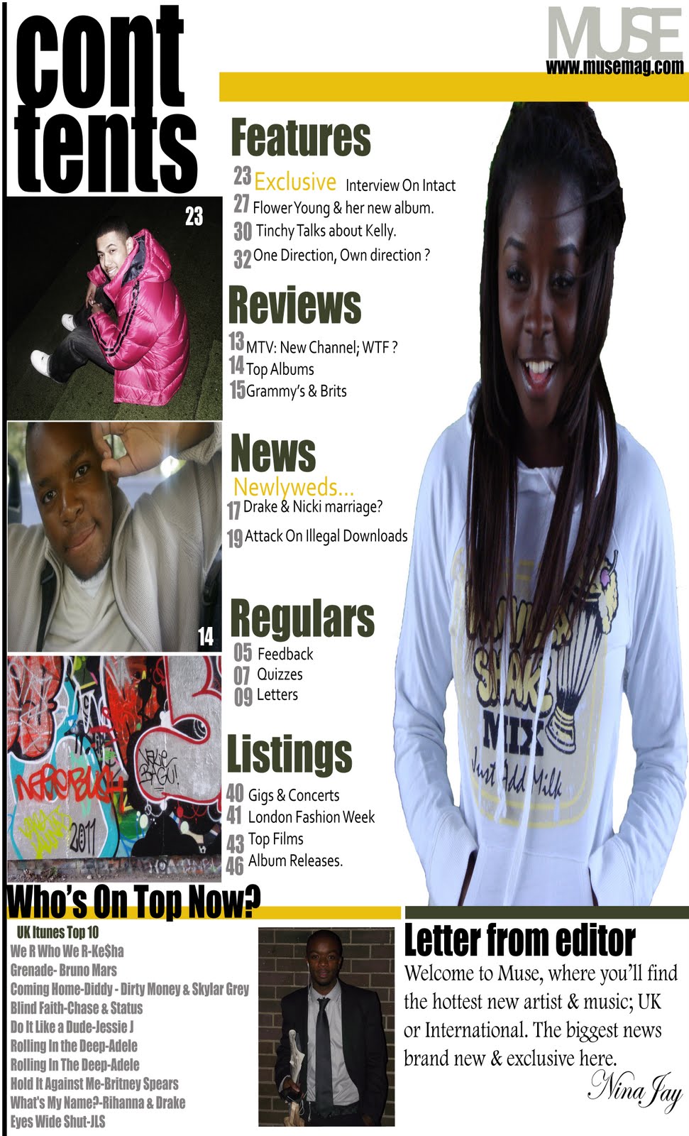
Before creating my magazine I had to do research on media conventions and how certain magazines conformed or challenged it and from there I had an idea of how my magazine should look like and how I wanted it to look like. I wanted my magazine to be a sort of niche magazine so I did U.K music based magazine and I’d like to think my product does fill a gap in the market. Although my magazine is unique it does conform to media conventions. For example the title block is the biggest text on the cover; it’s big, bold, graffiti print fill and is in front of the central image. I chose this type of font for my title as I learned from research how crucial the title is when attracting an audience. The central image also conforms to the conventions as it’s a mid-shot of the featured artist looking into the camera. The costume of the artist implies that they’re young but fresh. This helps to get the audience to engage with the artist. The setting of the image is a skateboarding park with graffiti everywhere. This would appeal to a younger audience as it may be a place where they spend a lot of their spare time. The barcode at the bottom right corner of the magazine, the feature artist as the central image alongside the anchorage text. The title ‘MUSE’ is an abbreviation of music, this type of colloquialism helps attract the audience also its quick and short and easy to remember like ‘Q’ magazine. My magazine however also challenges media conventions as it has an image of an up and coming U.K artist. This challenges media conventions as most if not all magazines only put renowned artists on the front cover which would of course attract a wider audience. It also challenges conventions as the female artist is not ‘glamorous’ and ‘revealing’. Instead of typically wearing a short dress or revealing clothing, she’s wearing a ‘hoodie’. The ‘hoodie’ symbolises her demanding the publics respect because of her music and not her ‘look’.
After analysing other magazines I realised that most female artists are represented as ‘sexy’ or ‘attractive’. In a way this is a good strategy for promotion and publicity, however I don’t think that should be the only reason why readers pick up the magazine so I did the opposite and showed my audience ‘real’ people. My music magazine represents young musicians from London as ambitious and talented instead of making them look desperate or ‘hungry’ for fame. I just interviewed the MC and gave realistic responses. It’s a very positive representation of young people that are into hip hop and R & B as the featured artists have dreams they’re trying to pursue, for example ‘flower’ seems very inspiring even tough her dad died she still had the courage to do something with her life instead of blaming her failures on his departure. I showed that young Londoners aren’t just about ‘drugs, sex and clubbing’ like what we usually see, but I represented them as wise young adults with dreams.
After remarking that Bauer Media products mainly cover International artists for instance ‘Heat’ magazine and ‘Closer’, I’d like to think that Bauer would distribute my magazine as it would fill a gap in their market. ‘Muse’ would be their only media product specialising in U.K music and artists. Although their products are mainly based on American artists, because that’s where most of the money is, they do have renowned UK radio stations that promote U, K music such as KISS100 and 4music; both specialise in urban and R&B music. However mine would differ to theirs and attract a wider audience as it mainly focuses on UK artists and music.
The audience for my magazine would be a young adult (male and female) between the ages of 16 and 24 within the C2 economic scale. They'd mainly live in the urban areas of London and would be interested in artists that have similar backgrounds to them. They're interested in UK & International music, dance & maybe sports. My audience aren't being catered for by any other magazine so my media product would be filling a gap in the market meaning there would be more sales.
Like the magazines I analysed before planning my magazine, I chose block colours in order to attract my audience, I took the image on a block green background & costumed the featured artist in a white jumper which bounces off the front cover, catching the reader’s attention. The title block is big short and one syllable. Making it easier for the reader to remember. I used a graffiti print from a photo I'd taken which created a more artistic and creative feel to the magazine. At the top right corner or the magazine I put a special offer 'first issue 99p' in red, which would help persuade the reader to buy it as it’s a bargain. I got inspiration from magazines such as ‘Q’ and ‘VIBE’, for instance Vibe uses bright block colours making it more fun and attractive.Using photo shop I learned how to edit images for instance adding lighting effects and airbrushing photos, diffusing the glow of the image, creating layers, editing text; adding shadows and glow. Using blogger I learned how to save an image as a jpeg file in order to be able to upload the image to blogger. I also learned how to edit and create new posts, and how to create a poll on survey monkey. Surveys were an important part of the planning of my magazine as I got to feel how a magazine title might be chosen & how the audiences opinion matter. Through Illustrator I learned how illustrate a magazine easily. Placing photos from my documents, adjusting my canvas to either a double page spread or just a portrait. Although illustrator didn’t require much knowledge of the program the little things made a big difference to my magazine pages, especially my contents page.Looking back at my preliminary task, I learned how colours and layout can affect your magazine. I also learned that sticking to conventions is important for instance the main articles are in the middle or the reviews are at the back. I've also learnt that you must fill up all spaces on your magazine. Although sticking to conventions is important I learned that you have to do something different in order to fit in, but also stand out - for instance, central image, special offers and freebies.
 . I could improve it by maintaining the same font throughout just to make it more neat. Also by using more images and filling up the gaps on the page by making the page more detailed.

 The word vibe is written in red, block capitals. Red is a commonly used colour with music magazines. It stands out, vibrant and bright. It can also symbolise the type of magazine it's about, maybe the red represents the passion it has for music as many people relate red as being a passionate colour. Behind this text, is what looks like the top of an old 60's hat. It's not easy to work out what it is which adds a mistic feel to the magazine making it more interesting to readers.
 This title block seems quite dull despite the fact yellow is a bright colour but looks dull against black. 'SOURCE' is deliberately written in big bold yellow caps horizontally to show its importance over 'the'. This method is effective as the reader instatntly gets the impression that this magazine is the source of all information needed. The font is sans serif and looks about a size 16. I think the magazine title is quite unique as most magazines end up using typical colours, but this seems a bit out the box which could symbolise originality and some readers may be able to relate to that as individuals.
  Q magazine is quite famos. The 'Q' is an acronym of the word 'Cue'. The font of the letter looks like a serif font, its big, white and similar to Time New Roman. Tis title block is very effective as it contains solely the letter 'Q'. This letter is made centre of attention, it's quick, short and snappy which makes it easier for readers to remember. The choice of red and white is common but this title brings something else to the table for readers. The font could represent the type of reader they're trying to attract as it seems quite sophisticated and we get the impression that it's and older company because of it. The red could symbolise its passion for music and could be appealing for people who love music.
 NME is an acronym for 'New Musical Express'. The title font looks like an Arial Narrow, it's red, capital blocks with a white outline making the red more intense. The use of these 3 colours are very effective as colours seem more vibrant and awake, it gives me the impression that the words are trying to tell me something. For example readers could easily think NME means 'Enemy' and this is because of the boldness of the text and colours. The acronym and colours makes this music magazine seem harsh which could simply symbolise their reputation in the industry.